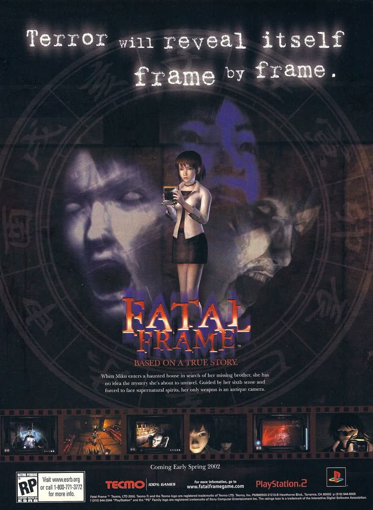
This poster does an excellent job in communicating the game’s mood through its composition, colour and overall tone. The main character Miku is ominously surrounded by the horrifying ghosts that appear in the games, She appears small
In the layout of this poster lies most of the issues, it is a deeply uninteresting piece from an extremely popular and once creative studio (Marvel), a brand that at least at one point, was considered consistently good to great with its output. This poster does not reflect that. The only genuine compositional idea is to fit the 3 characters on the poster into the spiderman logo’s shape, along with this idea being fairly bland and uninspired, the execution shares those adjectives. The poster looks clunky as a result of this design decision, as the central characters are awkwardly fitted into the bottom of the titular Spiderman logo, they just sort of exist on top of the logo, in the middle of the poster, like any other movie poster since the dawn of time. There are no themes communicated with the placement of the characters, they are truly just there, because they are the characters in the movie and they are recognisable actors. The poster makes a vague allusion to the locations travelled to in the movie, once again the callous, uninteresting placement of London and Rome in this case off in the background, barely even 10% of it each, communicates nothing. The title of the movie may indicate to the viewer that Spiderman travels to the locations in the background, but the images in the overall composition of the poster does not.
Leave a Reply