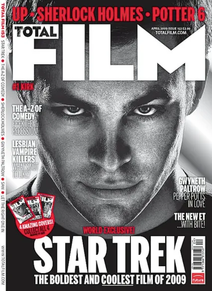
There is a dynamic edge to this masthead, it is bold and daring in a way, commanding your attention. The actual font is ultimately uninteresting, while impactful, it is hardly imaginative, the blocky letters only being offset from being completely visually ugly by the M which does look interesting. The word total being within the F portrays how this magazine is all about film, it is the sole focus of the masthead, magazine cover and magazine itself
RollingStone’s masthead/logo is of iconic status, with good reason, while nothing overly out there is going on, the sleekness and smoothness of the logo is its MO, the way the font is slanted, rounded and the curvature of certain letters take you across the logo as if you’re rolling across it.

Leave a Reply